FEATURED PROJECT
Customer Service De-escalation
turn an angry customer into a 5-Star Rating!

This is a scenario-based concept project designed to help call center customer service agents effectively navigate difficult calls from angry customers. The learner is challenged to use best practices throughout the phone conversation. This course provides a risk-free environment for agents to make decisions in the context of their roles and think critically about the behaviors which produce the best results.
Responsibilies: Subject Matter Expert, learning objectives, action mapping, storyboarding, graphic design, animation, eLearning development
Audience: Call center customer service agents for TechFusion Corporation
Tools: Articulate Storyline 360, Vyond, Adobe Illustrator, Adobe Audition, Adobe XD, MindMeister
The Problem
My client is TechFusion, an up-and-coming tech company. TechFusion has recently doubled the size of the customer service department, focusing on efficient call centers. There has been a decline in customer satisfaction ratings connected to call center experiences.
The Solution
Careful analysis of data revealed a correlation between calls from emotional customers and the lowest satisfaction ratings. Data collected from agents revealed a significant skills gap in de-escalation techniques. To address this performance problem, I proposed a multi-approach solution.
I recommended an immersive scenario-based learning experience that allows agents to navigate through a conversation while exploring the various consequences of common ineffective approaches and which approaches produce the most positive results. I decided this was the best solution as a first step because it creates a risk-free environment for learners to safely make mistakes and learn from them before participating in my recommended social learning experiences.
Increasing the learner’s confidence through the eLearning experience will result in more active participation in the next step of my proposed solution. With Sociocultural Learning Theory in mind, I also proposed in-person, non-evaluative coaching sessions, where learners share some of their most challenging calls and brainstorm possible solutions for similar situations in the future. Learners will also have the opportunity to role-play a variety of call scenarios and receive feedback from their peers. Recordings of actual calls can be used for a game-like activity, where small teams of learners can stop the recording when they hear a problem with the representative’s response within 60 seconds to point out an issue and offer a more productive response.
MY PROCESS
Using the ADDIE model, I developed learning objectives, an action map, a storyboard, visual mock-ups, and eventually an interactive prototype before I went into full course development. Each step involved multiple iterations based on feedback from other instructional design professionals until I had a solid foundation for the course.
Action Map
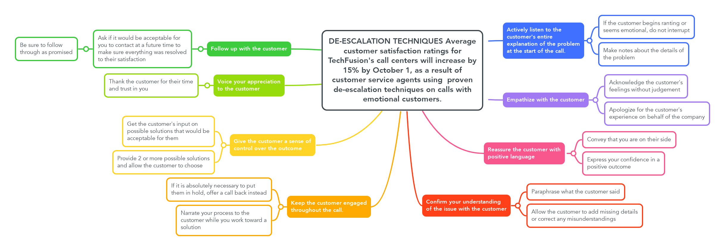
The action map was a way for me to layout the key de-escalation techniques gathered through research. The overall business goal is in the center of the map to ensure all actions are directly related to it. With the focus on behavior change, the map helped me focus on target behaviors over information-based material.

Text-based Storyboard
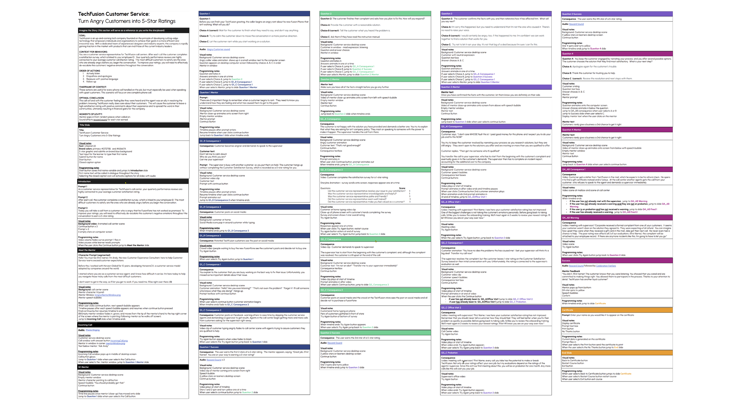
Once I identified high-priority actions, I created a blueprint for the entire course with a text-based storyboard. In order to immerse the learner in this experience, I set the story in the call center to mimic the context in which learners will be applying learned behaviors. I created a mentor character, to provide professional guidance anytime the learner wants support with their decision-making. I included real-world consequences for incorrect choices and positive rewards for making the correct choice.

Visual Mockups
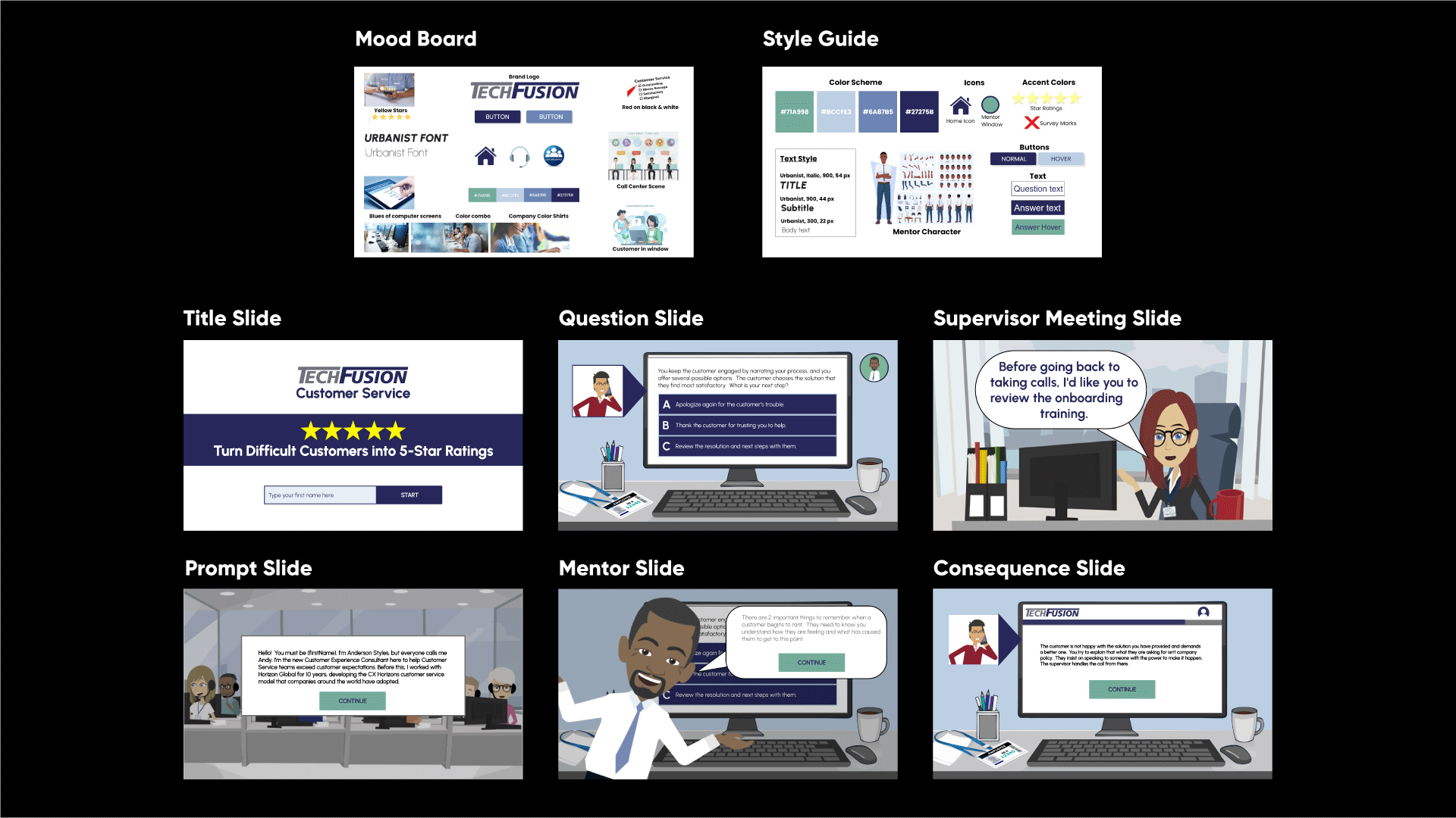
Before I could dive into developing the course, I created a mood board for inspiration as I made style and design decisions. As I narrowed in on the look and feel I was going for, I created a visual style guide to ensure continuity with the graphic elements such as color scheme, font styles and sizes, and illustration styles.

Interactive Prototype to full development
Using Articulate Storyline 360, I created an interactive prototype that included the introduction and the various scenes leading up to the first scenario-based question. I solicited feedback on the design and functionality from team members and mentors. I was reminded of the importance of “showing” the consequences in context rather than “telling” the consequences. Vyond is one of my favorite animation tools, so I decided to replace text with video clips showing the impact the agent’s choices make far beyond one phone call and one bad satisfaction rating. After several more iterations, the team agreed it was ready for full development.
Final Takeaways
I delivered a final draft of the full course to a test group of learners. Feedback from the test group reminded me of the importance of emphasizing the positive consequences in addition to the negative. A number of learners conveyed frustration over the length of the negative consequences following an incorrect response. As one tester put it, “I already knew I got it wrong, so I just wanted to get back to the question, find the right answer, and move on.” I knew the consequences were key in helping learners understand the importance of every customer interaction and shouldn’t be eliminated, but I also realized that in my enthusiasm to tell the story through video, I had included many extraneous details that had no meaningful impact on the course content. I was more intentional with my choices for video content in my next iteration, making the consequences brief and to the point. I balanced the negative with customer satisfaction stars and musical sound effects for correct responses. I was also able to add subtle levity to the experience through the mentor character without impacting the integrity of the learning objectives.

Before the learner needs mentor support with the first question, I added an opportunity for the learner to check in with the mentor when the phone first rings. The mentor’s first words of wisdom as the phone is ringing? “You should probably get that!” Another simple change was having the mentor pop onto the screen from all directions (including jumping from above), which also received positive feedback from the next test group of learners. The second time around I did not get any feedback about the length of negative consequence videos. One tester commented, “I liked the way I was reminded how important an agent’s word choices are to the entire company!”
I added custom JavaScript to Storyline that generates the current date on the certificate of completion and allows learners to specify how they would like their name to appear before printing.
Customize with JavaScript and Variables

I used variables to customize the experience for each learner. Characters address the learner by name throughout the course. Variables also allow for differentiated consequences and endings, depending on the choices of each learner.

Accessibility Conformance
Accessibility is a priority in my work. Storyline only offers the option for closed captions when a learner lands on a slide including audio files, which creates a problem with auto-playing media at the start of a slide. Learners depending on closed captions miss out on content until they are able to activate the captions. I believe accessibility should not change the quality of the learning experience if at all possible. The option to rewind content helps, but allowing the captions to be activated on the title slide maintains the integrity of the experience.
In addition to closed captions and control of auto-playing content, the user has the ability to adjust volume and font size. All important information included through text has been tested and meets the specified WCAG 2.2 contrast ratio requirement. All non-text elements conveying relevant information have alternate text that conveys the same content. The entire course has been tested using ANDI to ensure conformance with Section 508.

